In what ways does your media product use, develop or challenge forms and conventions of real products?
camerawork
sound
mise en scene
editing/post production
use of genre conventions
narrative organisation and the short film format
characterisation
themes and issues
Camerawork:
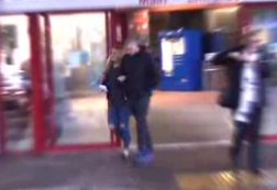
CU shot of the character from 'Guilty'
Over the shoulder LS of male character in 'Guilty'
The camera work normally seen in short films are usually lots of close ups, long shots and two shots. Depending on what the genre of the short film is, hand held camera are also a popular type of camera work to see. In the short film 'Guilty' it features many POV shots and the technique of an hand held camera is also used regularly. These techniques are used as this is a thriller therefore, these types of camera work fit nicely in with the typical conventions of a thriller film. Lots of MS and ECU are used in the short film 'Guilty' which really helps the audience in understanding and also feeling the characters emotions as they feel them. It also makes it clear what emotions the viewer is intended to feel. Different camera angles can communicate different meanings to the audience whether it is power, meaning or empathy. In the short film 'Guilty' the meanings behind the may high angle camera shots suggest that the protagonist is being watched by someone or something therefore this creates an enigmatic code as the audience want to know who he's being watched by.
ECU of Claire holding bay scan
Claire and Wesley holding baby scan
Our short film 'Delusion' uses lots of different camera angles and movements to create a variety of meanings and ideas throughout the film. When Claire and Wesley are shown standing outside the hospital through a low angle camera shot, it is unclear to the viewer that they are outside a hospital as the way the camera is positioned, it doesn't give away much background information however the next shot we see is an close up of the couple holding a baby scan photo and it is then made apparent that they have just picked up their baby scan and are now standing outside the hospital. The close up camera shot indicates the importance of the baby scan and how it is a significant prop in our story.
Claire and Wesley standing in their unborn babies nursery
A medium shot of the couple standing in the baby's nursery shows Wesley with his hand on Claire's baby bump and although you can see their lips moving and it is clear to the audience that they are having a conversation, we can not see or hear what they are saying. From the way that they are looking at each other and the fact that they are standing in their unborn baby's nursery suggests that they are talking about the excitement of the arrival of their baby. The importance of the medium shot is that you can see the location that their in. In the short film 'Birthday' there's is a scene of an elderly woman lying on her bed, from a medium shot you can see that she is her bedroom.
LS of female character in 'Birthday'
The final scene in 'Delusion' is a high angle shot of Claire lying on the floor as she has overdosed and died. The position she is laying in shows she has just fallen on the floor as her legs and arms are sprawled out from her. The short film 'Birthday' ends with an elderly woman over dosing and dying which is where we got the inspiration for our camera angles from. The end scene of ' Birthday' the elderly woman is shown lying dead on her bed with a high angle shot.
CU of female character dead in 'Birthday'
Sound:
Sound is a key element in a short film as it creates a mood that it wants the audience to feel and allows them to experience the emotions that characters in the film are feeling too. The use of diegetic and non-diegetic varies between the genre of the short film and dialogue is noticeably tended to be kept to a minimum. For the opening scene of the flashback we wanted the start of 'Anything can happen-Ellie Goulding" however due to Copyright reasons we couldn't find a version of this that we could use so we had to change our opening song. Instead we used parallel sound at the start of our film which was a happy upbeat song played on the piano which fitted in well with what was happening at this moment in our film, this part was the flashback scenes before the couple had their baby therefore it's intentions were to make audience feel their happiness and excited emotions as they watched. We also used parallel music at the end of our film to fit with the sad, dark atmosphere when Claire over doses. We used the song "Youth- Daugther" which has a sad feel to it therefore it fits nicely with what's happening in the film at this moment in time and it makes the audience feel empathy towards Claire.
LS of Claire watching tv with 'Theo'
The short film 'Birthday' also uses parallel non diegetic music when the elderly woman has overdosed. It has the same effect as 'Delusion' when Claire dies as it allows the audience to feel empathy towards the elderly woman and her husband.
We had some problems with the continuity of the diegetic sounds in some parts of our film where in some shots we had the tv on and in some we didn't. To solve this problem we used the background sound of a video from 'Peppa Pig' to put in the back ground so there wasn't random silent parts. By playing the 'Peppa pig' video in the background this solved our problem. Mise en scene:
The eleven elements of mise on scene are:
Lighting
Colour
Body language
Facial expression
Costume
Hair
Make-up
Props
Decor
Setting
Composition
Lighting
Set up of filming and lighting in graveyard
As lighting is such an important element in a film we wanted to make sure we had he right levels of lighting in the right places in our short film. We knew we wanted to edit the scene in the nursery to make have high key levels of lighting and a high brightness as we wanted this part to be apparent that it was a flashback. We used the lights on its strongest setting and shone them on Claire ans Wesley as we filmed so the brightness of the scene was increased. In the scene where Claire and Wesley are standing in the graveyard we used the lights to create a dark, depressing atmosphere but the way we used the lights was to make it clear that Claire and Wesley were the main part in this scene therefore we wanted the lighting to put all attention on them.
Facial Expression
Facial expression is also another key element for a short film. As shown by various extreme close ups and medium shots throughout our film it allows the audience to empathise with the characters so they understand what they're truly feeling. Most of the close ups of facial expressions are of Claire as it shows the stages of her different emotions.
LS of Claire
In the scene where Claire is watching tv and Wesley says he's going up stairs and to call him when dinners ready you can tell by Claire's face that she is annoyed a bit hurt by Wesley's reaction and this suggests that Claire is confused as to why he reacted in this manner.
Colour
As our short film was about the sensitive subject of losing a baby and the genre was drama we tried to make sure that the colours of the props and clothing wasn't too bright as we didn't want to suggest that the film had a happy theme. The colours the character of Claire wore throughout consisted of dark blues and greys and the colours the character of Wesley wore consisted of whites and blacks. Theo wears colours such as white and in the final scene he is wearing stripes. This is to make a statement and to clarify that he is a key element in our film and to make him stand out. In one of the final scenes where Wesley takes Claire to see their baby boy's grave, Wesley's costume consists of dark colours which helps set the mood for sadness and complements the dark atmosphere. Body Language
Body language is a huge part of any film as it can help demonstrate how a character is feeling. The scene where Wesley is walking home from work, he stands tall with his shoulders back which suggests that he may have an important job and may feel inferior. In the first present day scene we see Claire watching TV with baby Theo. The way she is sitting suggests that she may be on edge or she may just be a naturally timid person, she sits on the sofa with her legs and arms crossed as if she is protecting herself.
LS of Claire and Theo watching TV
Costume
The costumes in 'Delusion' had to be chosen carefully as we needed to make sure that the types and styles of clothing Wesley and Claire wore fit with their age range and the situation they were in. The scene where Wesley is walking home from work he is wearing black trousers, white shirt and a tie which implies to the viewer that he may work in an office or have an important job he is coming home from. Claire's costume's were more significant as we had to make sure that what she was wearing fit in with what she was doing.
Hair
Considering the characters Wesley and Theo have hardly any hair, their hair styles weren't changed throughout our whole film. However when Claire starts going through her breakdown her hair and the effort put into making it look nice significantly decreases. In the end scene Claire's hair is greasy and isn't brush which compliments the fact that she is having a breakdown as it suggests that she hasn't been taking care of her appearance and isn't bothered by what she looks like.
MS of Claire showing her natural makeup
Makeup
Claire's makeup throughout the film is natural and subtle as we wanted it to be clear from the start that she is a considerably young mother who would rather spend time with her son than doing her makeup. The scene where Claire is about to overdose her makeup is smudged down her face to make it obvious she had been crying. We done this by wetting a tissue and dragging her mascara down from her eyes to go with the effect that she is going through a breakdown.
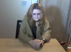
CU of Claire's hair
Props
We used numerous props in our short film. The first prop we used was a photograph which we filmed from behind to make it look like Claire and Wesley were holding their baby scan. This was a significant prop as this was the first scene therefore we needed to make it apparent to the audience that the couple were expecting a baby. Another prop we used in 'Delusion' was the milk bottle which caused an uproar from Wesley resulting in him storming out the room.
Décor
CU of Claire just before she overdoses and dies
When setting up our scenes before we filmed we had to make sure we didn't have any irrelevant props in any of our shots. For example many times we had to move cushions or picture frames from the shots as these would have made no sense in our film and caused confusion for our audience. We tried to make our settings look as homely as possible by placing blankets and baby related items in our shots.
Setting
Here is the sign at the entrance to the graveyard
This is the sign outside the hospital
We needed to use a few different settings in our film to help create the effect of our flashback and to show the different days. The settings that we used included, a house, outside a baby shop, the entrance of a hospital, outside the house and a graveyard.
Composition
Before filming our film we had to make sure that everything we wanted to be in the camera frame was exactly where we wanted it to be. We had to take our time on arranging cushions and in one of our shorts we felt like the coffee table was looking bare so we placed a candle just at the bottom of one of our shots. We felt like this helped make the setting appear more homely and was more convincing for the audience that a young couple did actually live here.
Editing and post production
Flashbacks
In our film 'Delusion' we used jump cuts and flashbacks. This challenged the typical conventions for short films as usually you wouldn't find these techniques in a short film. The flashbacks were used to show Claire and Wesley's happiness whilst Claire is pregnant with their baby. We used the song 'Anything could happen' by Ellie Goulding and edited brighter to make it obvious to the audience that this was a flashback. Another short film that uses a flashback is the film 'I miss you' . This uses flashbacks to show the male characters reliving memories with his girlfriend.
Jump Cuts
We used jump cuts to create a dramatic edge in the scene where Claire is breaking down. We did this to make the audience feel sympathy towards her as from the camera shots you can really see the fear from Claire's facial expression.
Use of genre conventions
The genre of our film is social realism as it includes real life situation which was phantom pregnancy as this could happen to anyone. Our film also has an element of drama therefore it is a hybrid, a hybrid is a mix of genres.
2.How effective is the combination of your main products and your ancillary tasks?
Here is our initial draft of our poster
The picture we used for our poster was of a baby's mobile above its cot. I feel that the shadow in the picture gives it an eery feel and suggests that our short film may have something supernatural or thrilling about it. We purposely didn't include any more of the cot than we needed to because we didn't want to give away if the baby is a boy or a girl as we wanted to create some uncertainty for the audience. We didn't include any characters on our poster as we wanted to create enigma for the audience as it would keep them guessing about what and who the film may be about. As we are a low budget film company we weren't able to create a trailer for 'Delusion' therefore our poster was a huge marketing appeal for us as this would be one of the main advertising roles. It took a lot of thought in what to have as our main picture for our poster. Our first idea was that we wanted half of the image missing to make it look like the image was there as well as not there. We took pictures of Theo and used photo shop to edit it to fade half of him.
Due to lots of research on short film poster I noticed that the title had to be the biggest and most striking font of the whole poster otherwise it wouldn't stand out. For example on the film poster for 'Cargo' the font is the first thing that catches the audience's eye as the title is written in big black font which is laid on a yellow background, making it easier to see. Underneath the title 'Cargo' there is a tag line, " The most precious of all". I felt like this tag line created an idea in the audience's head of what the film may be about however didn't give too much of the story, making us want to go and watch it. Tag lines are a key marketing strategy for any company as it increases the want of the audience to go and watch their film. When making our poster we realised through research that we wanted a tag line as this allowed the audience to guess what the film may be about. We wanted a tag line that wouldn't give away too much however gave the idea that someone in our film would be grieving. The tag line we eventually decided on was 'When grief distorts the truth.'
The review
The review has a completely different target audience to our poster in the sense that is found in the magazine 'Little White Lies'. Depending whether a film gets a good or bad rating all depends on the magazine editors opinion. A good review is an important factor when wanting to get good audience feedback on a film as your film is more likely to sell. The sophisticated lay out for a Little White Lies review is aimed at a middle and upper class demographic and the design is fairly challenging as it doesn't look like an ordinary film magazine.
3. What have you learnt from your audience feedback?
Our intended audience for 'Delusion' were both males and females, aged 25-35. We chose this audience as I feel like the audience may be able to relate to the story a bit more as the characters Claire and Wesley fit into this age range. We used the point of views from both male (Wesley) and female (Claire) and we showed how they may both deal with a situation like this differently.
For our audience we asked a variety of different people a mix of questions and asked them to answer them honestly. We done this by emailing them the link to the video then they answered the questions on facebook messenger.
The questions we asked were:
Joe Allen
Charlotte Newnham
Alex Kendall-Tobias
Due to having different opinions from our audience feedback I feel that if we were to make 'Delusion' again then we would maybe have more scenes with Theo in to make it more clear that Claire could see him and Wesley couldn't. There was only one scene where Claire could see him and Wesley couldn't however due to the camera shot, it wasn't emphasized that Theo was suddenly gone and I think this was a big mistake we made. I like the fact that each person who answered our questions said that they empathized with the young couple as this was one of our main intentions when making 'Delusion.
4. How did you use new media technologies in the construction, and research, planning and evaluation stages?
I asked people of our target audience to watch our film and asked some questions:
These were the responses:
Natasha Ruben (Claire)
Amber Williams
Paul Aylett
Charlotte Newnham
From this feedback I have learnt that people enjoy the unpredictability of the storyline and sympathize with both Claire and Wesley. If i was to improve the film, from their advice I would have Wesley walk in to see Claire dead and have more of a love story progress between Claire and Wesley.
How effective is the combination of your main product and ancillary texts?
Although we didn't make a film that strictly followed the points above, we did create a marketing package for our short film. This included the short film itself, the film poster and review.
Our target audience is 25-35 year old's that will be able to relate to strained relationships, loss and pregnancy/ having children. This meant that for our film poster, we kept it fairly simple.
The target audience for the film review, because it is in Little White Lies, is slightly different.
As you can see, Little White Lies has a very specific target readership. They target 18-30 year old students and professionals that are in the creative/ media industry. The target audiences' of our review and other products do overlap, which made it easier for our group.
We wanted to make sure that all three products are recognisable with each other. In order to do this, we used the mobile - which is the most important prop for our film, as it brings it from the flashback to the present tense. For the review, we used a still image from our short film.
In what ways does your media product use, develop or challenge forms and conventions of real media products?
a)
Camerawork
Sound
Mise en scene
Editing/post production
Use of genre conventions
Narrative organisation and the short film format
Characterisation
Themes and issues
We
had to research lots of short films, in order to get an idea of what
they're like. Although most of them weren't the same genre (so therefore
didn't carry many of the same conventions), they were still useful to
analyse.
Camerawork -
includes the camera movement (tracking in/ out, panning, zooming,
etc.), angles (low, high, etc.), shot distance (e.g. close up),
position/ framing, composition and depth of field. More information
In
'Black Hole', the reactions of the character is an important aspect. To
emphasise this, they have included many CUs. We thought this was a good
idea, and would also be vital to use in our film.
In
this particular shot from our short film, we wanted to show how happy
and excited the couple are feeling, also that they are feeling powerful
and in control of their lives. We also wanted to show the importance of
the object they're looking at.
This
method is also used in 'Focus', which was the same genre of our short
film. I was also inspired by the amount of angles used in 'Focus', so
we decided to also incorporate this idea into our short film. Angles
create meaning by making someone seem less or more powerful (in order to
convey their emotions). It can also emphasise the importance of an
object.
In
'Tyler', they used panning to follow the three main characters as they
are walking. We thought this was a good idea in order to make the
audience feel as though they are interacting with the characters. When
Wesley and Claire are walking out of the shop, we used panning so we
could follow them (to show how happy they are).
1) In what ways does your media product use, develop or challenge forms and conventions of real media products?
For our Advanced Portfolio we produced a 5 minute short film called 'Delusion' and a film poster and review to act as a marketing strategy to promote our short film. When constructing these, we have used, developed and challenged forms of real media products.
Before the construction of our short film, we researched short films to gain an insight into the conventions of them and how they vary from full-length films. I noticed that although they do have their differences, there are common features that are vital in the making of both short and full-length films:
Camerawork
Sound
Mise en Scene and characterization
Editing/Post production
Use of genre conventions
Narrative organization and the short film format
Themes and issues
Camerawork
Camerawork includes angles, movement and shot sizes. These are used to construct meaning, whether its emotion, empathy, enigma, ect. They can also be used as a way to assert power, for example having somebody at a low angle from a POV shot suggests that they are inferior to them.
Angles
As camera angles can be used to convey power, we used this in our short film. The scene is early on when Wesley arrives home from work and Claire is sitting down. We deliberately left Wesley standing up to construct to the audience that he is the more dominant and mentally stable one of the relationship. This is a high angle of Claire as she is sitting on the sofa watching Peppa Pig.
A MS of Claire taken from 'Delusion
This is a low angle of Wesley talking to Claire with a confused expression on his face as she had been watching Peppa Pig on her own - this links to her being mentally unstable and is the first sign of it.
A MS of Wesley taken from 'Delusion' An example of a short film which also has a male character at a lower angle than the female to hold dominance and to show that they are the stronger character is in 'Lovefield'.
A MS of character from Lovefield (Mathieu Ratthe, 2008)
We used high angles to create a sense of vulnerability and supported the gender stereotypes as our female character was the vulnerable one.
This is a shot from 'Delusion' when Claire is dead from overdosing. We shot this from a high angle so that we could make her look weak and defeated.
A LS of Claire taken from 'Delusion'
The same idea is shown in 'Attic Panic' to emphasize vulnerability as this female character is scared of the unknown as she is aware there is unwanted company around her. A MS of female character from 'Attic Panic' (David F.Sandberg, 2015)
A MS taken from 'Delusion' of Claire and Wesley
Movement
In our short film, we used tracking and panning shots.
This is a tracking shot from our short film where Wesley has just got home from work and is about to catch Claire watching Peppa Pig on her own. By using a tracking shot, it builds the suspense on what his reaction would be however that isn't clear to the audience yet as Theo (the baby) was in a previous shot as it was through Claire's eyes. This creates spectator positioning.
Tracking shots taken from 'Delusion' of Wesley
When researching short films, many of them used tracking shots however they differ from the one used in Delusion as our location was based in a house.
In the short film 'Exes' they used a tracking shot of the girl walking in the street. The same idea of mystery and suspense was presented in this tracking shot as you are unaware who the girl is as you can only see her from behind. It is also at the beginning of the short film therefore the spectator is unaware of the story line.
MS (tracking) of female character from 'Exes' (T.J Minsy, 2014)
We also used multiple panning shots in our short film, one being when Claire and Wesley are getting into the car to go to the graveyard because Wesley is showing Claire Theo's grave to gain the realization they both need. Just after the camera pans them both and they get in the car, sad non-diegetic music plays to add to the depressing tone.
2 shot of Claire and Wesley taken from 'Delusion'
2 shot of Claire and Wesley taken from 'Delusion'
Shot sizes
We have used a variety of shot sizes in our short film, from ECU to LS.
Here we have used a MS of Claire with her hands over her face. This is to reflect her emotions and to allow the audience to empathize with her as she is having a breakdown. This was followed by a range of shots from of different sizes at quick paces as this picture was taken from the jump cut.
MS of Claire taken from 'Delusion'
MS taken of male character in 'Growing Pains' (MP Cunningham, 2015)
https://vimeo.com/109210806 This MS is taken from the a short film I researched called 'Growing Pains'. The male character also has his hand over his face however he is doing it because he is expecting bad news regarding his dogs health. We adapted this to our film as it is one of the elements of Mise en Scene - body language.
This is a LS from a high angle of Claire dead on the floor after her overdose. The pills are beside her to add to the shock of her overdose which adds emphasis on her inability to cope with her sons death. This leaves the spectator empathizing with Wesley.
LS of Claire taken from 'Delusion'
Our film was inspired by a short film I researched called 'Birthday' where the women at the end overdoses and dies. We challenged this in the way that Claire's eyes were closed, however the character in 'Birthday' eyes are open which gives a more chilling feel.
MS of female character taken from 'Birthday' (Alessandra Sutto, 2013)
Sound is a vital convention of the making of a film. There are various different types of sound such as diegetic, non-diegetic, foley sounds, contrapuntal sound, parallel sound, synchronous, asynchronous ect.
Parallel sound is when the non-diegetic music suits the tone, mood and atmosphere of the film at the time - and contrapuntal is the opposite. We used parallel sound in our film, for example at the beginning in the flashback scenes, happy non-diegetic sound played. Similiary to this, towards the end of the film a non-diegetic soundtrack of "Youth - Daughter" played which has a very sad feel to it when accompanied by the short film. By using this non-diegetic soundtrack, we hoped that the audience would empathise with the characters and feel an emotional attachment to them, all the way through from the graveyard scene to Claire's death. An example of parallel sound from a short film I researched is in "Attic Panic" which is a horror. The female protagonist is being victimized by an unknown ghost like creature, and when the suspense builds and she becomes more endangered the non-diegetic/parallel sound builds to match the tone.
We thought carefully about the choice of sound for our film. Originally for the flashback scene at the beginning we wanted to use non-diegetic music of "Ellie Goulding - Anything can happen" however we were unable to use it for copyright purposes. Therefore we used a peaceful, piano piece that had a happy tone to reflect the couples excitement and joy at the upcoming arrival of their baby boy.
Shots of Claire and Wesley from flashback scene of 'Delusion'
We used a sound clip from YouTube as the diegetic sound from the television from filming when Claire is watching Peppa Pig was off in some scenes where there needed to be sound. We were able to add this clip in through the duration that we needed it for.
Mise en Scene
Mise en Scene is a key aspect when constructing the film as it helps to present genre, emotion, and simply is the making of characters. The 11 elements of Mise en Scene are:
Lighting
Colour
Body language
Facial expression
Costume
Hair
Make-up
Props
Decor
Setting
Composition
Lighting
We used lighting in our film in the graveyard scene to create a gloomy, depressing yet slightly sinister atmosphere. Although our film isn't a thriller, many thrillers/horrors have graveyard scenes were lighting would also have been used.
Shot taken from graveyard scene during filming
We also added lighting at the end, at the jumpcut scene where Claire overdoses. We wanted a brighter effect than just the basic lighting in the room to emphasize Claire, her emotions and the actions she is taking.
Costume
The use of costume signified a lot to the audience in our film. Through-out the film, you slowly start to see Claire letting herself go which reflects her emotions. She is on the verge of a breakdown and can't face getting up in the mornings. The idea is that she used to care for her appearance - immaculate make-up and hair but she starts to not care as she falls further into a depressive state.
Shot taken from flashback scene in 'Delusion' In this shot, taken from the flashback scene at the beginning, it is clear that Claire is looking healthy and well. She is wearing a lovely floral dress as she is ecstatic on the near arrival of her baby.
This is the beginning of Claire spiralling into depression. Her costume and hair is a huge contrast from how she looked in the floral dress. This is the start of her letting herself go, as Wesley is beginning to get more and more concerned for her and stressed. Her pretty dress has been replaced for a dressing gown, showing that she doesn't have the energy to get herself dressed anymore.
LS of Claire taken from 'Delusion'
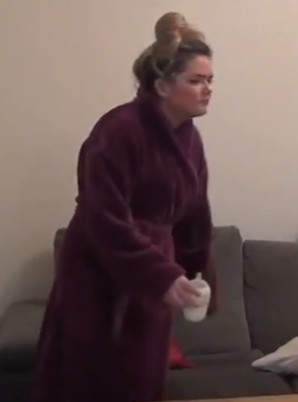
This shot is taken from the day that Claire overdoses. She is wearing a blanket over her, also used to signify her emotions - although she hasn't hit rock bottom yet.
MS of Claire taken from 'Delusion'
This shot is of Claire dead on the floor. She still has the blanket round her, and is wearing slippers. This indicates her unwillingness to get changed properly and lounge around.
LS of Claire taken from 'Delusion'
Make-up
At the beginning of the film, before Claire and Wesley realise how deluded Claire really is, her make-up is in tact. We used make-up as a way of showing to the audience the process of her breakdown.
At the scene of the graveyard, which is previous to the overdose scene where these pictures are from, Claire faces the realisation that Theo is dead and starts crying. We presented the idea of her crying through her make-up by giving her dark circles under her eyes and wetting mascara down her face. We also made her look more pale using lighter make-up.
Shots taken from 'Delusion' showing the transformation of Claire from healthy to her death
A picture taken of us putting on Natasha's make-up ready for Claire's overdose scene
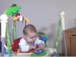
Props
We had a very significant prop to our short film which was my baby brother Theo. This made the storyline a lot easier as we filmed in my house, meaning that all of the others props needed (milk machine, baby chair, ect) were all of easy access.
A picture taken whilst filming - Theo (prop) pictured
A shot taken from 'Delusion' of the milk machine - prop
A shot taken from the film showing the baby chair - prop
Setting
We had different locations in our short film, such as: the baby shop, the graveyard, the house, outside the house and the hospital.
These are pictures from the hospital. We used this as a location because it shows the happy couple leaving as they've just received their baby scan and found out that they're having a boy.
This is a shot from the graveyard, followed by a picture of the sign for the cemetery that we took whilst filming. We chose to film here as we thought it would be the turning point in the film where realization hits Claire and it would be a dramatic moment. Graveyard scenes are commonly found in horror/thrillers therefore we have challenged conventions of real media products here as ours is a social realism drama.
Editing/Post production
We challenged the conventions of short films by using flashbacks and jump cuts. These aren't common editing techniques in short films because they're usually simple due to their not being a lot of time to present the story line and plot.
Flashbacks
Our short film opens with a flashback scene. We challenged conventions by doing this as we thought that it was the most efficient way to present to the audience the happiness of the couple before the death of Theo, whilst being unique. A short film I researched that used flashbacks is 'Never Forget'. Delusion differs from this in the way that our flashback scene opens the short film whereas in Never Forget the flashbacks are used when the female character was on the phone to communicate to the audience that she was lying about her whereabouts,
These are shots taken from the flashback scene. We added a special effect onto this to signify the fact that this is a flashback. As the flashbacks are the beginning shots, it isn't clear to the audience that they are of the past, before Theo's death therefore we think that using a special effect worked well.
Jump cuts
We used a jump cut as our ending scene to show Claire's mental state as she is having a breakdown and overdosing - resulting in her dying. Before we used a jump cut in our film, we experimented with it and researched it as jump cuts are very complex and difficult to do.
This is a video we researched as examples of jump cuts.
This is a shot taken from the jump cut scene. Claire is having a breakdown and is imagining Theo in her depressive state. The fast paced shots reflect Claire's mindset at that present time as she fails to cope with the fact that Theo is a figure of her imagination. We deliberately put the same special effect from the flashback on the shots of Theo to present this image of her imagination.
Transitions
Through-out the short film we used standard cuts, however after the flashbacks we added a dissolve transition to signify that it was going into present time. We also used a fade to black after Claire overdoses and dies, followed by the titles.
We used a fade to black after Claire's death as it is commonly used in films to signify death.
Use of genre conventions
Many short films don't fall into just 1 genre category, these are known as hybrids. Our short film 'Delusion' is a hybrid as it is a drama, but also a social realism film. There aren't any generic genre conventions for our type of genre, unlike many thrillers I researched in which the common iconography would be flickering lights, guns, fire, ect. We took a real life situation, inspired by the illness phantom pregnancy and adapted it to our short film.
The iconography of this were the pills, and we challenged the use of genre conventions in the graveyard scene as it's commonly found in thrillers/horrors.
Narrative organization and the short film format
There are two narrative structures - linear and non-linear (chronological and non-chronological). Many short films follow a simple, linear structure due to the lack of time there is to present the plot to the audience. We challenged this convention as our short film is a non-linear narrative as it begins with flashbacks. We chose this narrative as we believed that it would make our film more interesting and was the most effective way in showing the audience what Wesley and Claire were like before the loss of Theo. Growing Pains from MP Cunningham on Vimeo. This is a short film I researched called 'Growing Pains'. It follows a
simple, linear structure as it is in chronological order from beginning,
middle to end.
This short film called 'Flashback' has a similar non-linear narrative to ours as it also begins with a flashback. Todorov's theory:
Equilibrium - This is when Wesley and Claire are standing in their unborn baby's nursery talking excitedly about The being born.
Disruption - This is when Theo dies and the couple are heartbroken.
Confrontation -This is when Claire thinks that Theo is sill alive and keeps seeing him everywhere.
Resolution - This is when Wesley takes Claire to see Theo's
headstone in the cemetery and explains to her that he is dead and not
coming back.
New Equilibrium established - this is when Claire decides she can't
cope with the loss of her baby so she overdoses on pills and dies
Bordwell and Thompson's theory - Story and Plot
The story:
It is that Claire and Wesley had a baby boy, which died from cot death at age 5 months. Whilst Wesley has come to terms with the loss, Claire is suffering from depression and still see's Theo - she has convinced herself that he is really there. It's built up over time so Wesley is becoming more and more stressed. Claire can't deal with it any more, overdoses and dies. The plot:
The plot is that Claire and Wesley's son is dead and Claire still sees him. The realisation hits her when Wesley takes her to the graveyard to see Theo's headstone and she overdoses and dies.
Enigma Codes - Roland Barthe
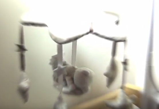
Enigma codes are where the narrative presents enigma for the spectatorand hints that action will follow. We used enigma codes in our film, such as the baby mobile at the beginning.
The way the baby mobile spins round, and then zooms in as the title fades into the screen creates enigma - along with the non-diegetic sound that the mobile plays. It suggests that something involving a baby will happen - in this case it is Theo's death.
Themes and issues
The issues portrayed in our short film is the issue of losing a child.
The Ancillary tasks:
b) Film Poster
There are conventions that you need to follow when making a film poster, such as a title, actors names, a billing block, production logo, ect. We used these conventions rather than challenging them to make our poster look professional. Here is our final film poster:
Here are some film posters that I researched:
In the film 'Silver Linings', they have used the characters of the film as the main subject of the poster. By doing this, they are giving away to the spectator that the film is about the male and female characters. With the tag line "love hurts" it hints to the audience that the film is based on a romance that blossoms between two characters. We adapted this to our film poster with the tag line "when grief distorts the truth". We used that tag line as a substitute for giving too much away on the poster by using characters like 'Silver Linings' does.
We originally were going to use a picture of Theo for our short film poster.
This was a draft for the film poster that I made. By using a picture of Theo as the main subject of the poster, I am letting the audience know that the film involved a baby - who must play a big part of the plot in order to be the main subject of the poster. In our final poster, we changed the idea of giving too much away and didn't use any characters,
We chose to use a cot mobile as the main image for our film poster as opposed to a character so that we were giving a slight hint to the audience however keeping it enigmatic. By using the cot mobile with the shadow behind it, it gives a mysterious feel and creates spectator positioning. When in the process of making the drafts for our film posters, I searched many film posters containing babies on them - one being "My fair baby". This inspired my draft poster, as it stars a baby on the front of the poster implying that the film is about the baby. I researched the film "71" as part of the research and planning task. I took conventions from this and used it in our short film poster "Delusion". For example, the quotes praising the actor Jack O'Connell, we took the same approach and praised our actress Natasha Ruben.
We also used conventions from the film "71" which is commonly seen on film posters of having statements from film festivals and star ratings. We used these to make our film look more professional.
Title:
Through-out my research on there was a continuous pattern of the title being the largest part of the poster, and the part that attracts the most attention - the most eye catching. Therefore, we made our title the largest thing on the poster so that the audiences eyes were drawn straight to the title. The background imagine of the cot mobile is quite light-coloured and vague so we balanced out the colours with black to make it more easy on the eye. Also, by making it black it look more bold and attractive as the title is the most important part of the poster to be seen, We used a bold font and then a more subtle font for the tag line deliberately, as it reads "when grief distorts the truth". For the tag line, the font is slightly wobbly and italic to reflect Claire's distorted vision and unstable depressive state.
Credit block:
All film posters have credit blocks on them, so to make our poster as successful as possible we also used one. They are usually placed at the bottom of the poster, as ours is and we placed it there so that it took up minimal space and didn't take any attention away from the title, main image, ect. The credit block involves the names of everybody involved in the making of the film and what their role was. It is illegal not to include a credit block on a film poster. We used a credit block with white font as opposed to black as the background colour becomes darker further down therefore white is more visible.
c) Little White Lies review
What is Little White Lies?
Little White Lies is an independent British film magazine which includes reviews, adverts and interviews. It is released every two months, the first issue was released in 2005, and it features writing, illustration and photography related to cinema.
An example of a Little White Lies review.
Who reads Little White Lies?
Survey conducted by The Church of England in 2008.
A sample was taken from 250 UK readers, which gives us an idea on the readership of Little White Lies and who they're trying to target. This tells us that:
Their readers visit the cinema:
0-4 times a month (72%)
5-10 times a month (22%)
11+ times a month (6%)
Demographics:
Aged under 18 (3%)
Aged 18-24 (34%)
Aged 25-35 (51%)
Aged 36+ (12%)
Male (63%)
Female (37%)
Employment:
Earn £0-20k (50%)
Earn £20-40k (42%)
Earn over £40k (8%)
Work in Media - Film, TV, Radio, Print (22%)
Work in Creative - IT, Advertising, Graphics (20%)
Student (12%)
From this, we can see that they are targeting mainly 25-35 year olds, males, people who earn less than 20k, and work in either Creative or Media. Their occupation, and the fact that they are regular cinema
go-ers shows that you need a keen interest in films to enjoy the magazines as it is aimed for people with a passion for the film industry.
What are the layout conventions?
The image is at the top of the page
The film title is centered below in the largest font
The directors name, followed by the cast and release date are placed below the title
The film title font is 'Century Gothic'
The actors/directors name, release date and main text is 'Aparajita'
The page is 196mm wide and 245mm long
Each collum is 52.4mm wide and roughly 107mm long
The image is 108mm wide and 70mm depth
We followed these conventions when constructing our film review in the house style of Little White Lies in order to make it look professional and as similar to the real product as possible therefore I planned my paragraphs before hand, analysed paragraphs in an existing Little White Lies review and researched the magazine.
My annotations of a current Little White Lies Review.
Here is a video explaining the making of a Little White Lies Review
Review Plan:
Have 5 paragraphs It will have a main image at the top It will include a 3 digit page number at the bottom It will include a rating at the bottom It will mirror Little White Lies
Paragraph 1 - Introduce directors, mention that they're starting up a low budget film company (AFJ). Link to genre.
Paragraph 2 - Brief synopsis of the film, define "phantom pregnancy", mention audience, contain intertextuality if can think of similar films.
Paragraph 4 - Mention key scenes of the film and genre conventions.
Paragraph 5 - Summary of film, opinions and positive last sentence.
Our Little White Lies review
We tried to stick to the review plan and the conventions of Little White Lies as much as possible by using InDesign.
2) How effective is the combination of your main product and your ancillary tasks?
In my opinion, the short film, review and poster work very well together as a great marketing strategy. The review and poster are designed to promote our short film therefore we have tried to make them look as appealing and professional as possible.
As we are a low budget film company, we don't have the advantage and wealth of creating a film trailer to market our film therefore we created a review and poster which is equally as important as a trailer. Our target audience for our short film is 25-35 males and females - we chose this age category because they are likely to have children themselves and can therefore relate to the characters and form a close connection with them. Our film would probably appeal to those older as well which is great, however we found any younger may not understand the emotion and heartbreak involved. We tried to promote our film to our target audience through our poster:
The Poster
Our film poster
Having researched film posters before hand, we recognized that the title should be the largest, most eye-grabbing feature of the poster. We illustrated this on our poster using a bold black font, and we used a similar one on our short film to make our products more recognizable and wanted to mirror them.
We had multiple ideas for the film poster, mostly involving a character - Theo. Our initial idea was to have a picture of Theo filling the poster, with half of him transparent to reflect the idea of the father (Wesley) being aware of his death and the mother (Claire) still seeing him. This is our original film poster draft. We changed our idea to our final film poster above as we didn't feel that it related to our target audience of 25-35 year olds as it could be mistaken for a more light-hearted, family film if there is little thought taken into the title. We stuck to the idea of having a bold title, as we have done in our final title as when researching existing film posters, the title was the most eye-catching part and will create recognition for your product.
Our original idea for our film poster Although this poster would work well combined with our film and review in marketing aspects, it gives too much away to the audience. It tells the audience - a horrible situation involving a baby happens in this film. It doesn't leave much to the imagination and simply a baby as the main subject is fairly bland in terms of a marketing strategy so we decided to use the cot mobile.
Another idea for our film poster We had a change of mind after experimenting with pictures of Theo for the poster idea and decided to play it simple with an image of a cot mobile. We agreed that this hints to the audience that a baby is involved, without giving too much away at the same time. The cot mobile as the main subject of the poster creates spectator positioning, keeps an element of surprise at what the film is about and lets the audiences imagination run free. We hope that the poster would intrigue the audience and create curiosity, resulting in them having a desire to watch the film.
The image we used for the poster
The tagline for our film poster
The tagline for 'Flyspy's film poster
As a substitute for not using an image containing a character from our film, we added a tagline which further hinted something of the story line to the audience. A film I researched which also did this was 'Flyspy'. Flyspy's tagline contains symbols related to film and cameras which suggests a lot about the film if you combine the name, we adapted this to our tagline and made it italics to reflect the idea that Claire's vision is wobbly and unstable. By using italics, and taking into account the word 'distort' it implies something of blurred vision however it doesn't reveal too much to the audience and leaves the audience guessing, which works well in promoting the short film.
This film poster, among others that I researched, highlighted the convention of a title being the boldest part of the poster which your eyes should be drawn to. It is normally the largest text of the poster, and I used these conventions in my film poster to promote and market the film. Our title on both the film and poster are black and bold, which makes them identifiable with each other. Although film title typography is highly important in the aspect that having the same font and style for your film and poster makes your brand more recognizable, as if people see the title they immediately know which product it is from, we challenged conventions and used different fonts for our film and poster.
Film poster I researched called 'Flyspy'
Title of 'Flyspy' on poster
Title of 'Delusion' on poster "Trebuchet MS"
Title of 'Delusion' on film- "1942 report"
For our short film, we used the font '1942 report' which we found on final cut pro. However, for our poster we used the font 'Trebuchet MS' which we found on Adobe Photoshop. We didn't use the same font as many other film and posters do because we thought the '1942 report' font worked really well for the film, however not the poster.
Title for the poster using the font '1942 report' We found that by using the same font that we used for the film on our poster (1942 report) it gave a more thriller look to the poster. I like the font in the film as it dissolves in and looks very mysterious, however I don't think it works as well on the poster. Our film is drama/social realism, and with this font it gives it a more sinister approach which could be misleading for our audience and therefore wouldn't be a good marketing campaign. Therefore, we thought it was better to challenge conventions by using different fonts and we kept our poster font bold and black, yet simple so that it was still eye-catching but didn't look like a horror/thriller.
The poster with the font '1942 report' We used quotations on our poster as we found that they were commonly used in posters that we researched. Ours was quoted by 'London Film Festival' as it is a low budget film company. By using the words "mesmerizing" and "heartfelt" the audience is aware that there is a lot of emotion attached to the film which gives something away about the genre, whilst crediting the actress.
Quotation taken from our poster
We used laurel leaves on our film poster, containing a 4 star rating and "outstanding film". This will immediately attract the audience and make them want to watch the film, therefore it works well in promoting the film. If a film has a high rating and good comments then people are more willing to watch them.
The Review
Alongside the poster, we also made a review to contribute to the marketing of our short film 'Delusion'. A review is vital to the success of a film, whether it is a mainstream feature length film or a low budget independent short film like ours. If it has a promising review, then it is more likely to sell and be successful as people of society and the film industry especially listen to critics.
Our Little White Lies review
We created our review in the style of film magazine Little White Lies, therefore we had to stick to the precise conventions of it and this also meant that our target audience was different. Little White Lies target audience is mostly males aged 25-35 who work in the creative or media industry. We didn't have to try to adapt to change too much when writing this as our target audience for our film was also 25-35 however our film targeted women as well.
A survey conducted by The Church of London
With a large majority of the target audience being film enthusiasts and working in the industry, I have used media related terms in the review such as "jump cuts" and "spectator positioning" as they will have a understanding of what they mean. It is important that the review sells the the film and portrays it in a good light, as the audience are film experts. Having a positive review from Little White Lies helps with the marketing and promotion of the film massively as people believe what the critic is saying and trust their judgement as like them, they're film fanatics.
If the review was negative about 'Delusion' then that would disadvantage our film a huge amount in terms of marketing as people would read it beforehand, listen to the review and not watch it. We chose to write a positive review that describes the film in a gripping way, not giving away too much and leaving the reader wanting to know more. In the poster we didn't include the characters however we mentioned them and their performance in the review which would leave the reader wanting to know more about them, what happens with them and general detail.
Picture from Little White Lies review We used this image at the top of the review as it shows the couple looking very happy as they look at the baby scan of their baby boy. It is from a low angle and is taken from the flashback scene with the special effect therefore it looks intriguing whilst not giving the plot away. It introduces the couple for the first time as they're not present in the poster, so it gives the audience some faces to match with the review.
On our Little White Lies review we have a rating at the bottom. They are rated on "anticipation", "enjoyment" and "in retrospect". We scored 4 out of 5 in all 3 of them, which would encourage people to watch our film and in turn work well in marketing the product. I think that the ancillary tasks combined with the main product work brilliantly together as a marketing strategy to get the production company and products known.
Rating from Little White Lies review
3) What have you learned from your audience feedback?
Our target audience for 'Delusion' were both males and females, aged 25-35. We chose this age range because as our film is based on an emotional real life situation, we wanted a sense of maturity when watching and also the audience could have children and therefore relate.
Although we have only used 3 characters in our film, we have tried to
appeal to our audience by using both a male and female character as the
mother and father, and then there are a few appearances from Theo - the
baby. We thought that portraying the women as vulnerable and supporting
the gender stereotypes, both women and men would empathize with her but
also the man for having to put up with her and then later on, losing his
wife.
A picture of Wesley taken from film
A picture of Claire taken from the film
A picture of Theo taken from the film
We gained audience feedback on the film from:
I found Facebook massively helpful as a source for audience feedback because its efficient and easy to use, and also everybody nowadays has access to it. It is very simple in the way that you can send a link for the video via direct message and people can instantly reply with their opinions, ready for me to process for improvement. Having shown our film synopsis beforehand, we private messaged people we knew on Facebook that fell into the age category for our target audience and asked them the following questions:
The message I sent via Facebook for audience feedback
Question 1) Did you enjoy the film, if so why?
Natasha Ruben (Claire)
I asked Natasha Ruben who plays Claire in 'Delusion' and she said that she enjoyed the film due to the unpredictability of it, I thought that it would be interesting to ask Natasha as she was involved in the making of the film so already had an idea of the plot.
Amber Williams
Tasha Alexander
Charlotte Newnham
Paul Aylett
From this feedback, I have learnt that people enjoyed the film, especially the idea of the flashbacks and the twist in the plot. People recognized that it is about a sensitive subject, which judging from these comments we presented well from the perspective of both the mother and father.
2) Do you like the story line and think that it is clearly illustrated?
Natasha Ruben
Amber Williams
Tasha Alexander
Charlotte Newnham
Paul Aylett
From this, it's clear that people thought the story line was clearly illustrated through-out and presented the characters emotions effectively and the sensitivity of losing a baby. Natasha thought that it was clearly presented through the use of flashbacks and Paul thought that we portrayed it in a clear way which allowed the audience to feel sympathetic. However, Tasha only realized the baby had died a little way in, which was intentional and the point of the film as the flashbacks were meant to present the couple before Theo was born, therefore we should have made that more clear.
3) Do you sympathize with the characters?
Natasha Ruben
Amber Williams
Tasha Alexander
Charlotte Newnham
Paul Aylett
From this feedback, I have learnt that all of the people asked sympathize with Claire and most with Wesley also as he has to come to terms with the loss of his son and deal with Claire's depression. Tasha and Natasha feel that Wesley could have been more understanding and sympathetic towards Claire and was too harsh, which means that we could have shown Wesley being more understanding and softer with her in her fragile position. Having said that, Amber understands why Wesley was angry as it would have been built up and his way of dealing with the situation.
4) What improvements should be made to our film?
Natasha Ruben
Amber Williams
Tasha Alexander
Charlotte Newnham
Paul Aylett
To summarize the points made, people would have liked to see more conversation between Claire and Wesley - perhaps more in depth conversation as we didn't include a lot of dialogue and most of what we did include was quite tense rather than showing their love for each other. Another point made was that we could have elaborated on the result of Claire's death from Wesley's position, for example having Wesley walking in to see Claire dead as Natasha suggested. If we had more time, this was something that we would have considered as it would have added to the suspense and emotion of the film. The other comments we received were positive, saying that the story line was good, as was the costume, make-up, ect.
5) As someone of our target audience, does this film appeal to you?
Natasha Ruben
Amber Williams
Tasha Alexander
Charlotte Newnham
Paul Aylett
On the whole, everybody asked finds the film appealing to them as it is entertaining, and gripping with the twist. These questions are helpful for audience feedback as they inform us on where we went wrong and what improvements to make, but also reassure us that the film does appeal to them - someone of our target audience.
We gained audience feedback on the poster by:
I found texting a really useful way to gain audience feedback for the poster as it is instant and everybody has access to a phone meaning we don't have to wait long to receive feedback. Using a phone was also very useful in recording footage.
I text a group of people of our target audience asking whether we should you a picture of Theo as the main image on the poster or something more subtle such as a cot mobile or empty cot. The replies were:
Natasha Ruben
Natasha thought that using an empty cot would be the best idea for our film poster as it is intriguing for the audience and allows numerous interpretations - creating spectator positioning.
Tasha Alexander
Tasha's opinion was that the cot mobile would be the best option for the film poster as it hints the story line to the audience whilst keeping the unpredictability of it a secret.
Millie Stokeley
Millie also thought that the cot mobile would be the most suitable option because it leaves the audience guessing the context of the film.
Toni Wilson
Toni thought the best idea for the film poster was to keep it subtle, meaning not to use a picture of Theo as the main image. However, he was unsure whether people would know enough about the context of the film from either the empty cot or cot mobile.
Aj Austen
Aj's thoughts were to use an image of an empty cot on the poster as it allows the audience to make their own assumption and interpret about what the context of the film is, resulting in their interest in the film increasing.
Emily Hodges
Emily's opinion was to use the cot mobile as the main image as it slightly hints to the audience that a baby is involved without giving too much away and invites the audience in, wanting to know more.
From this audience feedback we discovered that they all thought that we should use either an image of an empty cot for the poster or the cot mobile for the poster. We took their feedback constructively and chose to use the cot mobile as it leaves even more to the imagination than the empty cot. As the majority have said, it promotes interest and is intriguing for the audience
We gained feedback on the film synopsis by:
We showed 5 people a text containing our film synopsis, asked them 3 questions about it and then wrote down their thoughts on them. These were our findings:
Our synopsis:
"Our short film is about a young couple trying to cope with the loss of their baby. Claire (mother) suffers from phantom pregnancy which means that she believes her baby is still alive and still sees him. For example, in our film there will be a variety of shots where Theo (the baby) is present in Claires eyes however we will have a POV shot from Wesley's (dad) perspective and the baby won't be there. As a result of Claire's inability to cope with the loss of Theo, she overdoses and dies. Our short film will begin with a flashback of Claire and Wesley when Claire is pregnant, where they are happy and looking at baby clothes in the nursery. Claire's hallucinations causes strain on their relationship as Wesley doesn't understand her condition and Claire is constantly trying to convince Wesley that Theo is still alive. This drives Wesley to take Claire to the graveyard and show her Theo's grave, which triggers her overdose."
Question 1: What do you like about our film? Question 2: Where would you expect to find it? Question 3: What would you change?
Charlotte 1: I like the story line because it's not too complicated and you will be able to sympathize with the main character. 2: I would expect to find this film on a professional short film site. 3: I would maybe turn the ending around by the husband finding her and helping her get through this.
Phoebe 1: I like how you spin around the happy beginning. 2: I would expect this to be shown on YouTube. 3: I would maybe change it so they haven't actually lost the baby.
Kelly 1: I like this film because it sounds like a typical drama. 2: I would maybe expect it to be shown on TV. 3: I would change it so the man is grieving instead.
Harry 1: I like how it's quite simple so you can make it really good. 2: I would expect to find it on Vimeo. 3: I would make it more like a thriller because I find this genre boring.
James 1: I like the idea of her overdosing at the end because that will come as a shock. 2: I would expect to find it online, on a website or on YouTube. 3: I would make a bigger thing about how the main character is feeling.
From this feedback we learnt that people liked the idea of the twist in the story line, however thought that we should make a bigger thing about how Claire is feeling. That is why we decided to make the ending all about her with the jump cut scene as people liked the idea of the over dose at the end as it would shock the audience. Charlotte and Phoebe wanted us to make it a more happy ending, by the husband helping Claire through it so that she didn't result to an overdose, or Theo not actually being dead. We decided to keep the synopsis how it was, as people loved the idea of the twist and the shock factor that 'Delusion' brings.
4) How did you use media technologies in the construction and research and planning and evaluation stages?


