Friday, 27 November 2015

Film poster research - Submarine

SUBMARINE


The actor's names are all shown just above the billing block. Some of these names are popular and well knows (e.g. Craig Roberts) British actors. They aren't very clear; they are a similar font size to the billing block. The main character, who is played by Craig Roberts is shown in character as Oliver (the main character). We can see that he is playing in character in this photo because of his facial expression and costume. 
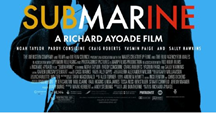
The text at the top is kept out of the way of the main image, but the bottom text covers some of the main image. I don't think that the text at the bottom effects the main image much as it still draws attention to the image, and the part of the character's body isn't necessarily important. The top text has a white background, which is one of the main colours used for the design of the film. It also makes the other colours used stand out more.
The main text is bigger than all the other text, and the colours used links to the actual film. The font is easy to read and stands out. 
 The main character is used for the main image, this is because he's the most important and the whole film mainly focuses on him. It also allows the poster to reveal what the character's personality is like. A blue screen is put over him, which is one of the main colours used. It stops just below his eyes, which in turn draws more attention to these. The blue background could also suggest how the character feels submerged.

The layout is very central, in order to focus on the character shown. 

The slogan used at the top gives the audience a clue to what the film is about and what genre it falls into.

We are shown different film critic reviews by Vogue, Los Angeles Times and the Daily Telegraph. These are all well respected newspapers/ magazines, and are usually read by people with a good cultural background. It targets the target audience well by using these.

The billing block merges into the film poster's design by using the same font and text colour. It is slightly smaller than the other text to conceal it slightly.  


M the film poster conforms to the typical conventions of romcom dramas; it uses bright and colourful colours and clear text. The image is the main part of the poster, and through this, the main character's facial expression stands out.
R the main character represents a weak and vulnerable schoolboy who is confused. His hair is floppy, he is nervously holding the strap of his schoolbag and his tie is slightly uneven. This goes against the stereotypical schoolboy that is usually shown in films (ladies man, enjoys playing sport, rebellious, cocky).
A the target audience would be teenage girls who already know some of these actors, and enjoy watching romoms. It could also be those interested in fashion or music, as there is a review and this film is well known to have the soundtrack by Alex Turner. Some young adults may also be interested due to the other critic reviews, and they may enjoy watching light-hearted British independent films. The reviews shown are from well respected newspapers and magazines, representing that this is a film for people who have a real interest in independent films, and those who are well educated.
N the narrative shown through this film poster would be that the film is about a nervous and confused schoolboy.
G the genre is a romcom drama; shown by the design of this poster.   

Thursday, 26 November 2015

Poster research - Flyspy


FLYSPY

The names of the actors are shown on the poster of the Sci-Fi short film 'Flyspy'. They're shown at the top of the poster in the centre in small writing therefore they're not very eye-catching, although the surnames are bigger and bolder than the fornames, possibly to gain recognition and publicity.


 The main image on the poster is of a fly with camera for eyes, which reflects the film title. From this, it suggests the plot of the story which is that the fly spys through its cameras. The character isn't the main subject of the poster, but there is a women in a doorway at the back of the poster. This could mean that she is the victim of the fly's spying, creating an eerie feel and creating enigma. There is
 text above the title in white font reading 'watching was not enough' which implies that it's taken further than just spying on the women which creates suspense for the audience as it doesn't give anything away however it hints. 


The text has some of the letters replaced with symbols which signify cameras as they're upside down play buttons. The title is a bold part of the poster as the text is large and it is placed under the main image so that it doesn't draw attention away from it. 


There is a billing block at the bottom of the poster, which is fairly generic. It is in small font. 


Media Language 

The poster as a whole is very dark and mysterious and has the conventions of a thriller. The background image is dark as it is portraying the image of a fly on a floorboard in an empty dark room. There is light in the background of the image to show that the door is open, with a female character in the doorway. The female character is also very dark, giving a shadow look. The main image of the fly is lighter than the overall poster, making it stand out. Although it is also dark, it has little detailed coloring in it such as green and blue. There is low key lighting, creating an eerie feel.

Representation 

Femininity is represented due to the female character in the background. She is wearing a skirt, and is thin, It isn't clear about her features as the directions have made it suspenseful for the reader to keep an element of surprise, however from what is visible it looks like she supports the femininity stereotype of big breasts and bottom.

Audience 

The audience for this film would be both genders, who enjoy the sci-fi/thriller genre.

Narrative 

The narrative of this story seems that a character in the film has made a fly to spy on the female shown on the poster.

Genre 

The genre of this film is a sci-fi but has the conventions of a thriller. 

Wednesday, 25 November 2015

Film poster research - Dissonance

DISSONANCE


The actor's names aren't shown on the poster - this is another minimalistic short film poster. The information on this poster is limited to the title, billing block and one logo for a competition. 
The text is kept away from the main image, all the information is kept at the bottom. The image still carries on behind this text, but it's made to look like a plain black background. This keeps the attention towards the main image, and helps towards the eerie effect the design has.
The billing block is slightly to the right, with an award to the left of it. This could put more focus on the award (as a way to advertise this film). 
The image must have been made by Photoshop, and the colouring also looks as though it has been edited through this.  


The title 


The main image they have used is an image of something that represents the earth, with houses all around it. It also has flat land with houses below it. The yellow background represents the sun, the beginning of life/ morning - this could be hinting towards the narrative.

There is one reference to a short film competition based in Berlin. This will attract an audience that are interested in international short films, and people who know about this competition.


 The title is much larger than any other piece of text on the poster; it is spaced apart to stand out even more. It also gives it a slight sci-fi look to it - this could link to the film as it already looks as though it could be this genre. The text matches with the rest of the poster; it looks really eerie. The colour is used to stand out, and also contrasts with the background of it.

M the short film includes different conventions of different genres. From the main image I would guess that this film was about the world - possibly how houses are taking over the land. The wires coming from the bottom of the earth also makes it look as though this could be a sci-fi.
R the poster could possibly represent how we are running out of space for houses, and it could also be representing the natural beauty of the world.
A the target audience for this short film would be both gender, and adults as it looks like the idea behind the film could be difficult to understand. It would also be people who are extremely interested in international short films, and know of the competition it was in.
N the narrative that this poster is telling is something about the world.
G the genre of this film would possibly be a sci-fi. The font used for the title is the main reason as to why it looks like it's a sci-fi.


Monday, 23 November 2015

Film poster research - Sorice

SORICE 


The names of the actors aren't shown of this poster, possibly because they aren't known for doing anything else and are upcoming actors. I think another reason why they didn't show this could be to limit what they have on the poster - as clearly the design is very minimalistic to create a mysterious and purposely dull look to the poster of this short film.  


The title is kept away from the main image in order to emphasise the importance of this character, and also the text is placed near to the rope to draw attention to this. 
The background used is gloomy and grey, this could represent the whole mood of this short film. The character is faced away to hide his identity, this means that we instantly fear this person, and we wonder what they are trying to hide. Overall, the poster is extremely basic to keep our attention on the character shown.

The main image is the main character in the short film - the effect of this is to make people wonder about this character and it also shows how significant this character must be. 
A rope is shown to suggest violence and death.


The film poster has a reference to another film, which would mean it attracts one type of audience (people who enjoy watching short/ independent films). It also refers to the fact it's an "Angelo White film", which would again attract a specific audience.

The film website is mentioned to encourage the audience to go onto this and find out more information, which would then encourage them to watch the film. This is a common method to use nowadays as it's easy to look websites up, and this will also link to social media sites (which means the word will be spread).

The size of the title is bigger than all the other text on the poster, but doesn't stand out much due to the thin design of the text. This is unusual for film posters as usually the title of the film covers most of the poster. I think they have chosen it to be like this to emphasise the importance of the character shown, and it also gives it more of a secret identity (as the title isn't even that clear).

The colours used are linked to the darkness of the film; they are all dull and sinister. The text also delivers this effect by using a sans serif design.


The billing block has been adapted to fit in with the poster by using a font colour that merges with the background, and it is positioned with the other text. 

The main character (that's used for the main image) is placed over a non-image, plain grey background - which makes them more powerful and mysterious. It also means that the focus is just on this character.

A central layout is used for the film poster, in order to make the character look even more significant, and to aid the minimalistic look of the poster.


M the poster uses many typical conventions of the thriller genre, and also some from the horror genre. It is very dark coloured and the main character/ main image used does not reveal the identity - this creates enigma and fear. Enigma is also bought by the lack of text on the poster. The rope signifies death, as well as the costume worn by the character.
R the character represents death by wearing black and having no obvious identification (we don't see their face).
A people who enjoy thrillers and horrors will look at this poster and the design will convince them to watch this. The target audience for this short film would be young men who are interested in short, independent thrillers/ horrors.
N the story we are being told through this poster is that this person has either died, or has bought death. We instantly feel afraid of this character due to their costume and the overall colours of the poster. Also we link the rope to committing suicide by hanging.
G the genre is clear - it is a thriller or possibly a horror.


Tuesday, 10 November 2015

Evidence of editing

 
Here we were labelling our shots so that its easier to recognise which scene it is. This makes the editing process a lot quicker as we can identify which shots are useful or not.


This video is of us discussing which effect to use on our flashback as it is a significant part of our short film - it is also the opening. It was important that we discussed this as a group and we looked at a variety of effects before choosing the one we thought worked best.


This video shows us deciding on the effect 'Light Rays' and all agreeing on it. As a group we found this effect sucessful in conveying a flashback.


Friday, 6 November 2015

Evidence of filming

This is evidence of make-up whch is a key aspect of mise en scene. We previously researched and experimented how to use make-up to convey a tired, run down look and we put this into practise. Jess and Frances applied makeup onto Tash (Claire) to make her look like she is on the verge of a breakdown.


One of our scenes was filmed in Haywards Heath cemetery. We got permission before doing this. We waiting until it was dark and then went down to the cemetery to film one of our scenes, we wanted to be dark so that it created a more tense atmosphere and we wanted our audience to feel sympathy for the couple.


This is a picture of us filming the scene where Wesley and Claire are at Theo's grave, the start of Claire's breakdown. We used lights to enhance the significance of the grave stone as it is a key prop in this scene.


Monday, 2 November 2015

Shooting schedule

First shooting (Tuesday 3rd Novemeber) - This will take place at the nursery as it will be the flashback scene. We will then shoot the scene in the cemetery. For this scene we will need lights as we're filming it in the evening. For the flashback scene Claire will be wearing a dress and will be looking healthy. We will need to bring a change of clothes for Claire as the graveyard scene is a different day in the film. By this point, Claire is in a rough stage of her life therefore she looks unhealthy and run down which is illustrated in her make-up which we will need to bring. For Wesley, we also need to bring a change of clothes to signify the different days.