SUBMARINE

The actor's names are all shown just above the billing block. Some of these names are popular and well knows (e.g. Craig Roberts) British actors. They aren't very clear; they are a similar font size to the billing block. The main character, who is played by Craig Roberts is shown in character as Oliver (the main character). We can see that he is playing in character in this photo because of his facial expression and costume.
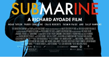
 The text at the top is kept out of the way of the main image, but the bottom text covers some of the main image. I don't think that the text at the bottom effects the main image much as it still draws attention to the image, and the part of the character's body isn't necessarily important. The top text has a white background, which is one of the main colours used for the design of the film. It also makes the other colours used stand out more.
The main text is bigger than all the other text, and the colours used links to the actual film. The font is easy to read and stands out.
The main character is used for the main image, this is because he's the most important and the whole film mainly focuses on him. It also allows the poster to reveal what the character's personality is like. A blue screen is put over him, which is one of the main colours used. It stops just below his eyes, which in turn draws more attention to these. The blue background could also suggest how the character feels submerged.
The layout is very central, in order to focus on the character shown.
The layout is very central, in order to focus on the character shown.
The slogan used at the top gives the audience a clue to what the film is about and what genre it falls into.
We are shown different film critic reviews by Vogue, Los Angeles Times and the Daily Telegraph. These are all well respected newspapers/ magazines, and are usually read by people with a good cultural background. It targets the target audience well by using these.
The billing block merges into the film poster's design by using the same font and text colour. It is slightly smaller than the other text to conceal it slightly.
M the film poster conforms to the typical conventions of romcom dramas; it uses bright and colourful colours and clear text. The image is the main part of the poster, and through this, the main character's facial expression stands out.
R the main character represents a weak and vulnerable schoolboy who is confused. His hair is floppy, he is nervously holding the strap of his schoolbag and his tie is slightly uneven. This goes against the stereotypical schoolboy that is usually shown in films (ladies man, enjoys playing sport, rebellious, cocky).
A the target audience would be teenage girls who already know some of these actors, and enjoy watching romoms. It could also be those interested in fashion or music, as there is a review and this film is well known to have the soundtrack by Alex Turner. Some young adults may also be interested due to the other critic reviews, and they may enjoy watching light-hearted British independent films. The reviews shown are from well respected newspapers and magazines, representing that this is a film for people who have a real interest in independent films, and those who are well educated.
N the narrative shown through this film poster would be that the film is about a nervous and confused schoolboy.
G the genre is a romcom drama; shown by the design of this poster.
Doesn't the blue represent water - submarine and that he is submerged? Perhaps?
ReplyDeleteLayout is very standard centring
Regarding audience, it is an independent film and the reviews are quite highbrow - certainly LA Times and Telegraph.