Friday, 18 December 2015


Wednesday, 9 December 2015
Review Plan
Our review plan will:
Have 5 paragraphsIt will have a main image at the top
It will include a 3 digit page number at the bottom
It will include a rating at the bottom
It will mirror Little White Lies
- Paragraph 1 - Introduce directors, mention that they're starting up a low budget film company (AFJ). Link to genre.
- Paragraph 2 - Brief synopsis of the film, define "phantom pregnancy", mention audience, contain intertextuality if can think of similar films.
- Paragraph 3 - Introduce main protagonist, mention cinematography, jump cut, flashback.
- Paragraph 4 - Mention key scenes of the film and genre conventions.
- Paragraph 5 - Summary of film, opinions and positive last sentence.
Tuesday, 8 December 2015


Thursday, 3 December 2015
What are the layout conventions of Little White Lies?

The image is always placed at the top of the page, with the film title underneath and centered - which is the largest font and also coloured. The directors name, release date and cast is placed beneath this, also centered and smaller. There are normally 5/6 paragraphs of text regarding the film review, the first letter is larger than the others and goes three lines down. At the bottom left there is a tripartite rating system.
- The film title font is 'Century Gothic'
- The actors/directors name, release date and main text is 'Aparajita'
- The page is 196mm wide and 245mm long
- Each collum is 52.4mm wide and roughly 107mm long
- The image is 108mm wide and 70mm depth
What is Little White Lies and Who Reads It?
What is Little White Lies?
 Little White Lies is an independent British film magazine which includes reviews, adverts and interviews. It is released every two months, the first issue was released in 2005, and it features writing, illustration and photography related to cinema. It is published by London-based creative agency The Church of London and the editor is Matt Bochenski. Little White Lies currently retails at £6 an issue, although subscriptions can be set up. It is unique as each issue is inspired by its feature film, represented on the cover by an illustration of its lead actor. The content is split into six chapters: the lead review, an editorial introduction, a series of articles inspired by the feature film, theoretical reviews, the back section and future releases. It uses a tripartite ranking system where it rates the films on the categories: Anticipation, Enjoyment, and In Retrospect - they are ranked out of five and accompanied by explanatory text.
Who Reads It? - Target Audience

The Church of London conducted a survey in late 2008, where a sample was taken from 250 UK readers. This allows us to have an idea of who reads Little White Lies and who its trying to target. They did this by asking the readers some questions, relating to their interests and other aspects. They found that:
Their readers visit the cinema:
- 0-4 times a month (72%)
- 5-10 times a month (22%)
- 11+ times a month (6%)
- Aged under 18 (3%)
- Aged 18-24 (34%)
- Aged 25-35 (51%)
- Aged 36+ (12%)
- Male (63%)
- Female (37%)
- Earn £0-20k (50%)
- Earn £20-40k (42%)
- Earn over £40k (8%)
- Work in Media - Film, TV, Radio, Print (22%)
- Work in Creative - IT, Advertising, Graphics (20%)
- Student (12%)
From this, we can see that they are targeting mainly 25-35 year olds, males, people who earn less than 20k, and work in either Creative or Media. Their occupation, and the fact that they are regular cinema go-ers shows that you need a keen interest in films to enjoy the magazines as it is aimed for people with a passion for the film industry. They also discovered that just over half their readers play video games and buy DVD's regularly, and 93% read almost all of the magazine and keep their copies.
Tuesday, 1 December 2015
Fim poster draft

I have chosen a wobbly styled font, to emphasise the name and reflect the main character Claire's mindset. I have used a billing bock, and specially chose a picture of Theo smiling to add a sense of emotion to the film. For the final poster, I will add star ratings from sources such as the Daily Mail, actor names and be more creative with the photo to improve it.

FILM POSTER

My film poster is split in half to represent the different point of views that Claire and Wesley experience throughout the film.
The black background contrasts the opposite image of Theo - Wesley can't understand what Claire is going through and doesn't see Theo, but Claire does.
I used a basic font for the title in order to look more professional, and to keep the focus on the image.
The black background contrasts the opposite image of Theo - Wesley can't understand what Claire is going through and doesn't see Theo, but Claire does.
I used a basic font for the title in order to look more professional, and to keep the focus on the image.
Monday, 30 November 2015
The pact- Frances

The pact
The image on the poster is of old fashioned brown wallpaper perhaps in someone's house, with a face and two hands appearing as if they are trying to push through out of the wall. The lighting at the top of the poster has high levels of lighting however the bottom of the poster is black underneath the face trying to push through. There are no actors names that appear on the screen however there is a tag line 'are you alone in your house?' this suggests that the movie might be about a house getting possessed by some of evil spirit. There are critics comments and a production block right at the bottom of the poster.
Media Language
The tag line and the face trying to push out of the wallpaper suggest that the movie is a thriller however this is the only character we see and nothing is revealed about the actors in this film.
Audience
The audience intended for this film could be 18 and above because it looks too scary for anyone under this age.
Genre
The genre of this film appears to be a horror because of the low levels of lighting and and the tag line.
Narrative
The only thing on the poster that suggests what it could be about is the tag line. The tag line suggests that the film is about a family who's house is getting haunted by an evil spirit.
The one I love- Frances

The one I love
The poster for this low budget independent short feature length film appears to be hand painted. The picture is of a middle aged man with brunette hair and glasses and a stern facial expression, He is standing in what looks like the ocean, there is a reflection of him in the water his reflection looks identical to him apart from the fact that his reflection doesn't have any glasses. There is a young woman in the water next to him, she looks a good 5 years younger than him and has long blonde hair and an evil expression on her face. Her reflection in the water seems to be identical to her. The title is written in block capital across the whole of the screen covering part of both characters faces and the names of the two main actors is written in small font underneath. At the top of the screen in a critics appraisal and the generic production block appears at the bottom of the screen.
Media language
The media language suggests that male character in the film has two identities as his reflection in the water is different to his actual face.
Representation
The representation of this movie might be love as it shows two characters, a male and a female and they both appear to be naked in the water.
Narrative
Not much is given away about the narrative on this poster however it might be about a young couple that fall in love.
Genre
The genre for this film may be a romantic comedy due to the setting that the two characters are in.
I lost my dream-Short film poster Frances

I lost my dream
The background of this poster looks likes it is hand painted with water colours to look like a sun set. The character is a male around the age of 18-20, he is looking up at the title 'I lost my dream' above his head as if he is looking up at the sky wistfully. The title font is made to look as if it is written in black marker pen. The character is foreign looking wearing a black tee-shirt, he has bright blue eyes with tanned skin and curly brunette hair. There are no characters names on this poster or a production block. The only other text apart from the title is who the film is made by and 'The true story of Moacir Zeledon'. There is no critic appraisal or age certificate either.
Media Language
The picture of the character is from an eye level shot, he is looking up at the sky, perhaps he is dreaming.
Representation
The poster represents masculinity and perhaps ethnicity as the character is inspired by someone with a foreign sounding name.
Audience
The poster appears to be targeted at an audience of adults due to the lack of information we get about this film from the poster.
Narrative
Not a lot is given away by the poster but we can guess this film is about a young man having a dream but for some reason he is unable to pursue this dream or it is in some way taken from him.
Genre
My guess is this film is a romance.
Sight-Short film poster Frances

Sight
A close up picture of a male's head fills the whole poster. This man could be the main character in the movie, he looks as if he is in character as he is staring straight ahead into the camera with a blank facial expression which gives the poster a slightly thrilling edge. The title 'sight' is placed over the male's forehead so it stands out. The title is written in block capitals and is a light blue/white colour. The male's eyes appear to have some kind of illusion inside which could have something to do with what the movie is about, perhaps this male character is blind and the reason he is blind is revealed in the movie. The character's forehead and the skin around his eyes is slightly blurred which makes his eyes stand out more, suggesting that his eyes are a key element in this film. The back ground behind the male's head is completely black which gives us no indication of where this film may be set.There are no tag lines or critics ratings on the poster or even a production block. There is only who the film is by and names of two of the actors, this lack of information creates mystery on the poster. There isn't an age rating or a release date on it either.
Media language
The male character looks around mid thirty's, he has a high forehead and stubble on his face. Although we can't completely see, it appears he is wearing a grey blazer with a white shirt. He has dark circles under his eye which could be a key element in the film, perhaps its due to lack of sleep or a drug/alcohol problem. There is a light shining on the left hand side of the characters face but apart from this, the poster is dimly lit with low levels of lighting, this lack of light and colour suggests that the film may be a thriller.
Representation
This film represents masculinity and disability because the poster represents that the character on the poster is blind.
Audience
The intended audience for this film could be males 18-30 as the colour scheme and layout suggest that it is aimed for an audience who enjoy thrillers.
Narrative
Not much is given away about the storyline on the poster but we can guess that this movie is about a man who struggles or cant see at all.
Genre
Thriller or horror.
Friday, 27 November 2015
Poster research - Silver linings

SILVER LININGS
The actors names appear just below the main image. They're not hugely prominent, however the surnames are bolder and bigger than the forenames. Two characters are presented on the poster, one male and one female. The male character is facing towards the camera, however the female character is facing the male character, This could suggest that in the film, she loves him and chases him however he ignores her. This links to the text in between the characters reading "love hurts" in small black font.

The title of the film is just under the actors names. The title 'silver linings' suggests that bad things happen in the film, but theres always a positive thing that happens to. The colour of the title is yellow, which is a happy colour.
There is a billing block at the bottom of the poster, and a website.
Media Language
The picture of two characters are close ups from eye level. The background is blurred and the colours are very simple.
Representation
There is representation of femininity and masculinity. The poster suggests that it is the women needing the man, therefore it supports femininity stereotype,
Audience
The audience would be mostly females - teenagers and adults
Narrative
The plot of the story is that the women is in love with the man however he doesn't want to be with her, but it all works out in the end.
Genre
Romantic comedy
Poster research - 71

71
One actors name is shown on the poster, which is the character seen in the picture. This suggests that he is the main character and is the main focus which is why no other characters are named. Also, a reason for this could be because Jack O'Connell who is the actor seen in the picture has a large fan base, therefore by having his name and picture on the poster is attracts a wider audience. The name of the producer of the film is also stated on the poster, but in smaller text than the actors name. Their names are placed either side of the title, perhaps to attract attention to them. The title is in large, white text at the right side of the poster.
The main image fills the poster, of a male character holding a gun wearing a soldier uniform. The colour has an effect to create the feel of a war zone, and in the background of the picture there is smoke coming out of the house and crowds of people, The image fills the whole poster, therefore the text is on top of the image. There is critics praise for the film at the top of the poster in fairly big, bold text reading "EXTRAORDINARY" which would attract the reader.

There is a billing block at the bottom of the film poster, which is fairly generic. The word "Entertainment" is at the bottom of the billing block.

Media Language
The main image of the male character is a middle shot, and he is wearing a soldier uniform and hat which is a blue/grey colour. The poster as a whole is blue/purple/white and the text compliments it, The gun and uniform signify the fact that this is a war film as does the colours.
Representation
The poster represents masculinity, war and soldiers fighting for our country. As this is a British film, it represents British soldiers.
Audience
Due to the main actors fan base, the audience would be both genders - mostly females, from teenagers to adults. Judging from the critics, reviews and rewards the film is targeting well-educated people.
Narrative
The narrative is about a soldier, therefore the film will portray the struggles of war. It is set in 1971 and as it is a British film and you can see terrace
houses in the background, this must be about the conflict in Ireland
when England were at war with the Terrorist group, the IRA.
Genre
The genre is war.
Poster research - Breaker Breaker

BREAKER BREAKER
The names of the actors are shown at the bottom of the poster, some names are in bigger text than others and the name 'Pat Healy' is the biggest and stands out. This suggests that its the name of the main character.
There is an image of a male character which takes up a large amount of the poster, this could mean that he is the main character. He is wearing a policeman/sheriff hat which tells us that he is a figure of authority. The title is in big, bold red font at the bottom of the poster, the first part is on top of the main image.

At the bottom of the poster, there is the name of the production company and their Facebook and Twitter page with the logos. This is to gain recognition as they're a small production company and therefore want to gain recognition.
Media Language
The main picture is a medium shot of a male character from a low angle to reinforce his authority. He is wearing a beige uniform which looks like a police uniform, and a hat and sunglasses. He appears to be looking into the distance, and as an audience we are unsure what that is he is looking at. It is fairly colourful as the sky is a deep blue and the title is red,
Representation
The poster represents masculinity, and also the representation of policemen due to the uniform.
Audience
The audience is probably adults, mostly males and people of the police force.
Narrative
Not a lot is given away by the poster, therefore all we can assume is that the plot is about a policeman.
Genre
Possibly drama.
Film poster research - Bend It Like Beckham
BEND IT LIKE BECKHAM

The character's names aren't shown on this poster, but the main character is shown. They are in character (we can see this from the costume and prop that she's holding). It looks as though the character's head is 'up in the clouds', which could represent how she has dreams that are extremely difficult to achieve.
The main text is kept away from the main image, it gives most of the attention towards the main image. The design is used to look like it has actually been bent, and the colours link to the cultural background of the main character. The title (and all of the other text) is shown over a sky background. This links to the film and also is quite plain to make everything else stand out.
The main text is only slightly larger than the rest of the text, this is to create more emphasis on the main image. The text design is also bent to link with the title name, and could also be symbolising a goal post (as this film is about football). All of the texts' colours represent the main character's cultural background. They could also possibly represent their football uniform.

The slogan "A winning comedy" is used, which tells us that this is a comedy and also entices the reader by using the word "winning".
A website for the film distribution company is shown on the poster - this means that people can go onto this and find out more information.

There are two critic reviews and two award logos shown at the top of the poster - the Entertainment Weekly & the Mirror, and Sundance & Toronto international film festivals. The critic reviews attract people who enjoy lighthearted films, and the awards attract people who know a lot about films.
The billing block of this poster merges into the background design; it's blue.
The poster tells us that it's out this Spring, which means that people will view this and will start to get excited about watching this when it's released.
M conventions from the romcom genre are shown in this poster; the colours and bright and colourful. There is also a hint of the sport genre with the football boots and the sky. The character is shot from behind to hide her identity - which is a hint of the storyline.
R the girl is represented as being a Punjabi girl, who has a hidden passion for football.
A the target audience for this film would be teenage girls, who may also enjoy football. It could also be targeted at those of the Punjabi religion. It would also appeal to British Asians as a whole, due to the problems the character faces (which will be relatable to this audience) and the outfit she's wearing. The shoes are shown in order to conflict against her sari.
N the narrative of this film is a football fanatic who also seems to be Punjabi.
G the genre is a sport romcom.
Film poster research - Submarine
SUBMARINE

The actor's names are all shown just above the billing block. Some of these names are popular and well knows (e.g. Craig Roberts) British actors. They aren't very clear; they are a similar font size to the billing block. The main character, who is played by Craig Roberts is shown in character as Oliver (the main character). We can see that he is playing in character in this photo because of his facial expression and costume.
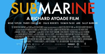
 The text at the top is kept out of the way of the main image, but the bottom text covers some of the main image. I don't think that the text at the bottom effects the main image much as it still draws attention to the image, and the part of the character's body isn't necessarily important. The top text has a white background, which is one of the main colours used for the design of the film. It also makes the other colours used stand out more.
The main text is bigger than all the other text, and the colours used links to the actual film. The font is easy to read and stands out.
The main character is used for the main image, this is because he's the most important and the whole film mainly focuses on him. It also allows the poster to reveal what the character's personality is like. A blue screen is put over him, which is one of the main colours used. It stops just below his eyes, which in turn draws more attention to these. The blue background could also suggest how the character feels submerged.
The layout is very central, in order to focus on the character shown.
The layout is very central, in order to focus on the character shown.
The slogan used at the top gives the audience a clue to what the film is about and what genre it falls into.
We are shown different film critic reviews by Vogue, Los Angeles Times and the Daily Telegraph. These are all well respected newspapers/ magazines, and are usually read by people with a good cultural background. It targets the target audience well by using these.
The billing block merges into the film poster's design by using the same font and text colour. It is slightly smaller than the other text to conceal it slightly.
M the film poster conforms to the typical conventions of romcom dramas; it uses bright and colourful colours and clear text. The image is the main part of the poster, and through this, the main character's facial expression stands out.
R the main character represents a weak and vulnerable schoolboy who is confused. His hair is floppy, he is nervously holding the strap of his schoolbag and his tie is slightly uneven. This goes against the stereotypical schoolboy that is usually shown in films (ladies man, enjoys playing sport, rebellious, cocky).
A the target audience would be teenage girls who already know some of these actors, and enjoy watching romoms. It could also be those interested in fashion or music, as there is a review and this film is well known to have the soundtrack by Alex Turner. Some young adults may also be interested due to the other critic reviews, and they may enjoy watching light-hearted British independent films. The reviews shown are from well respected newspapers and magazines, representing that this is a film for people who have a real interest in independent films, and those who are well educated.
N the narrative shown through this film poster would be that the film is about a nervous and confused schoolboy.
G the genre is a romcom drama; shown by the design of this poster.
Thursday, 26 November 2015
Poster research - Flyspy

FLYSPY
The names of the actors are shown on the poster of the Sci-Fi short film 'Flyspy'. They're shown at the top of the poster in the centre in small writing therefore they're not very eye-catching, although the surnames are bigger and bolder than the fornames, possibly to gain recognition and publicity.
The main image on the poster is of a fly with camera for eyes, which reflects the film title. From this, it suggests the plot of the story which is that the fly spys through its cameras. The character isn't the main subject of the poster, but there is a women in a doorway at the back of the poster. This could mean that she is the victim of the fly's spying, creating an eerie feel and creating enigma. There is
text above the title in white font reading 'watching was not enough' which implies that it's taken further than just spying on the women which creates suspense for the audience as it doesn't give anything away however it hints.

The text has some of the letters replaced with symbols which signify cameras as they're upside down play buttons. The title is a bold part of the poster as the text is large and it is placed under the main image so that it doesn't draw attention away from it.

There is a billing block at the bottom of the poster, which is fairly generic. It is in small font.

Media Language
The poster as a whole is very dark and mysterious and has the conventions of a thriller. The background image is dark as it is portraying the image of a fly on a floorboard in an empty dark room. There is light in the background of the image to show that the door is open, with a female character in the doorway. The female character is also very dark, giving a shadow look. The main image of the fly is lighter than the overall poster, making it stand out. Although it is also dark, it has little detailed coloring in it such as green and blue. There is low key lighting, creating an eerie feel.
Representation
Femininity is represented due to the female character in the background. She is wearing a skirt, and is thin, It isn't clear about her features as the directions have made it suspenseful for the reader to keep an element of surprise, however from what is visible it looks like she supports the femininity stereotype of big breasts and bottom.
Audience
Audience
The audience for this film would be both genders, who enjoy the sci-fi/thriller genre.
Narrative
The narrative of this story seems that a character in the film has made a fly to spy on the female shown on the poster.
Genre
The genre of this film is a sci-fi but has the conventions of a thriller.
Wednesday, 25 November 2015
Film poster research - Dissonance
DISSONANCE

The actor's names aren't shown on the poster - this is another minimalistic short film poster. The information on this poster is limited to the title, billing block and one logo for a competition.
The text is kept away from the main image, all the information is kept at the bottom. The image still carries on behind this text, but it's made to look like a plain black background. This keeps the attention towards the main image, and helps towards the eerie effect the design has.
The billing block is slightly to the right, with an award to the left of it. This could put more focus on the award (as a way to advertise this film).
The billing block is slightly to the right, with an award to the left of it. This could put more focus on the award (as a way to advertise this film).
The image must have been made by Photoshop, and the colouring also looks as though it has been edited through this.

The title

The title

The main image they have used is an image of something that represents the earth, with houses all around it. It also has flat land with houses below it. The yellow background represents the sun, the beginning of life/ morning - this could be hinting towards the narrative.
There is one reference to a short film competition based in Berlin. This will attract an audience that are interested in international short films, and people who know about this competition.

The title is much larger than any other piece of text on the poster; it is spaced apart to stand out even more. It also gives it a slight sci-fi look to it - this could link to the film as it already looks as though it could be this genre. The text matches with the rest of the poster; it looks really eerie. The colour is used to stand out, and also contrasts with the background of it.
M the short film includes different conventions of different genres. From the main image I would guess that this film was about the world - possibly how houses are taking over the land. The wires coming from the bottom of the earth also makes it look as though this could be a sci-fi.
R the poster could possibly represent how we are running out of space for houses, and it could also be representing the natural beauty of the world.
A the target audience for this short film would be both gender, and adults as it looks like the idea behind the film could be difficult to understand. It would also be people who are extremely interested in international short films, and know of the competition it was in.
N the narrative that this poster is telling is something about the world.
G the genre of this film would possibly be a sci-fi. The font used for the title is the main reason as to why it looks like it's a sci-fi.
Monday, 23 November 2015
Film poster research - Sorice
SORICE
The names of the actors aren't shown of this poster, possibly because they aren't known for doing anything else and are upcoming actors. I think another reason why they didn't show this could be to limit what they have on the poster - as clearly the design is very minimalistic to create a mysterious and purposely dull look to the poster of this short film.

The title is kept away from the main image in order to emphasise the importance of this character, and also the text is placed near to the rope to draw attention to this.
The background used is gloomy and grey, this could represent the whole mood of this short film. The character is faced away to hide his identity, this means that we instantly fear this person, and we wonder what they are trying to hide. Overall, the poster is extremely basic to keep our attention on the character shown.
The main image is the main character in the short film - the effect of this is to make people wonder about this character and it also shows how significant this character must be.
A rope is shown to suggest violence and death.

The film poster has a reference to another film, which would mean it attracts one type of audience (people who enjoy watching short/ independent films). It also refers to the fact it's an "Angelo White film", which would again attract a specific audience.
The film website is mentioned to encourage the audience to go onto this and find out more information, which would then encourage them to watch the film. This is a common method to use nowadays as it's easy to look websites up, and this will also link to social media sites (which means the word will be spread).
The size of the title is bigger than all the other text on the poster, but doesn't stand out much due to the thin design of the text. This is unusual for film posters as usually the title of the film covers most of the poster. I think they have chosen it to be like this to emphasise the importance of the character shown, and it also gives it more of a secret identity (as the title isn't even that clear).
The colours used are linked to the darkness of the film; they are all dull and sinister. The text also delivers this effect by using a sans serif design.
The billing block has been adapted to fit in with the poster by using a font colour that merges with the background, and it is positioned with the other text.
The main character (that's used for the main image) is placed over a non-image, plain grey background - which makes them more powerful and mysterious. It also means that the focus is just on this character.
A central layout is used for the film poster, in order to make the character look even more significant, and to aid the minimalistic look of the poster.
M the poster uses many typical conventions of the thriller genre, and also some from the horror genre. It is very dark coloured and the main character/ main image used does not reveal the identity - this creates enigma and fear. Enigma is also bought by the lack of text on the poster. The rope signifies death, as well as the costume worn by the character.
R the character represents death by wearing black and having no obvious identification (we don't see their face).
A people who enjoy thrillers and horrors will look at this poster and the design will convince them to watch this. The target audience for this short film would be young men who are interested in short, independent thrillers/ horrors.
N the story we are being told through this poster is that this person has either died, or has bought death. We instantly feel afraid of this character due to their costume and the overall colours of the poster. Also we link the rope to committing suicide by hanging.
G the genre is clear - it is a thriller or possibly a horror.
Tuesday, 10 November 2015
Evidence of editing

Here we were labelling our shots so that its easier to recognise which scene it is. This makes the editing process a lot quicker as we can identify which shots are useful or not.

This video is of us discussing which effect to use on our flashback as it is a significant part of our short film - it is also the opening. It was important that we discussed this as a group and we looked at a variety of effects before choosing the one we thought worked best.
This video shows us deciding on the effect 'Light Rays' and all agreeing on it. As a group we found this effect sucessful in conveying a flashback.
Subscribe to:
Comments (Atom)